ApplyGrad
Redesign of an
application management system
[UX Design]
ApplyGrad
Redesign of an application management system
[UX Design]
TEAM
Amrita Sakhrani, Bidisha Roy, Brandon Fiksel, Rituparna Roychoudhury & Tommy Byler
TIMELINE
Apr 2020 - Jun 2020
ROLE
UX Research, Information Architecure, Wireframing, User Testing & Final Prototype Screen (For Admission)
CHALLENGE
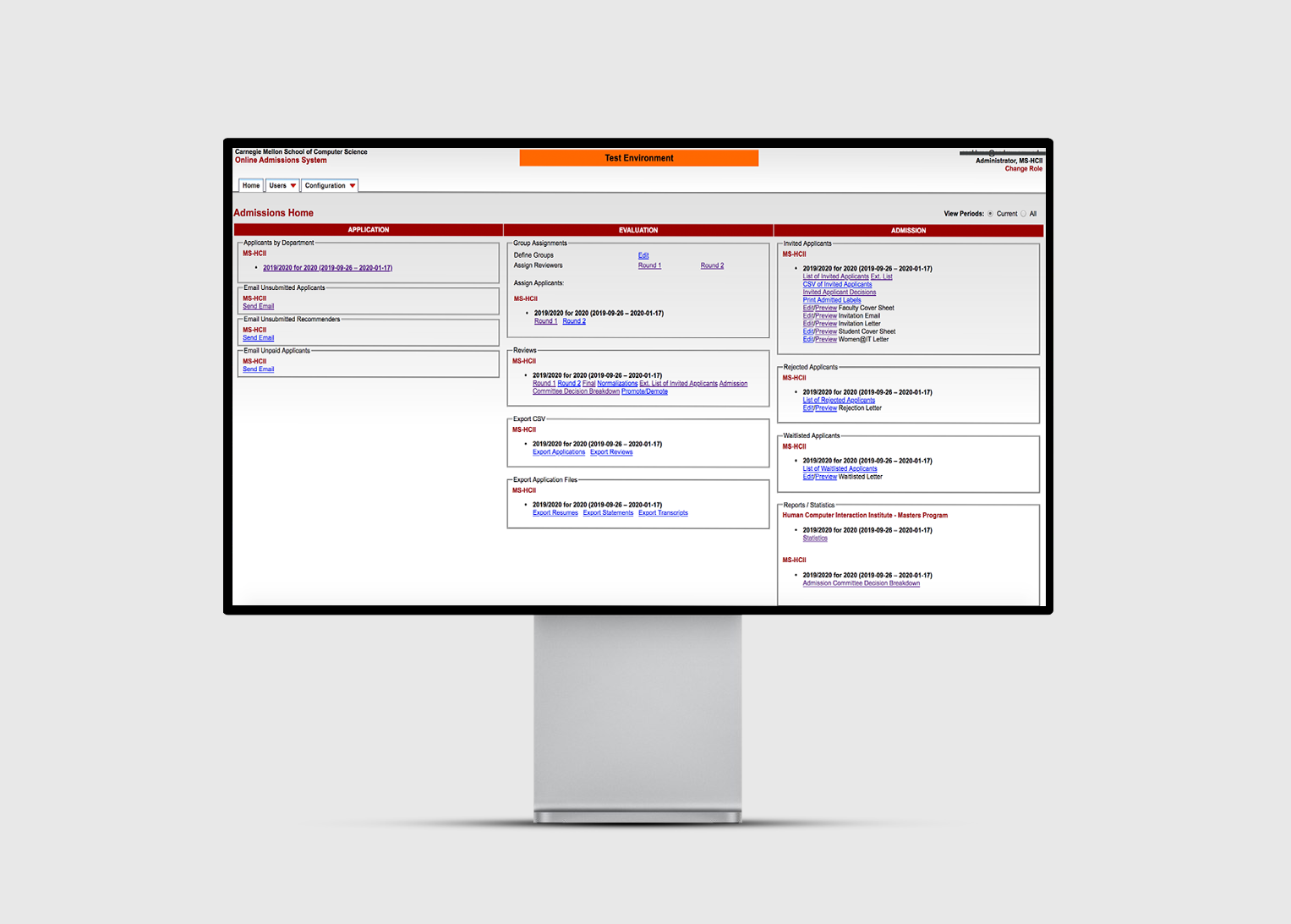
ApplyGrad is a web application that the School of Computer Science uses to process all graduate and PHD applications. Each administrator for each program uses this system individually to process, review and eventually admit applicants during each cycle. We were tasked as consultants to review and improve the overall usability of the system.
SOLUTION
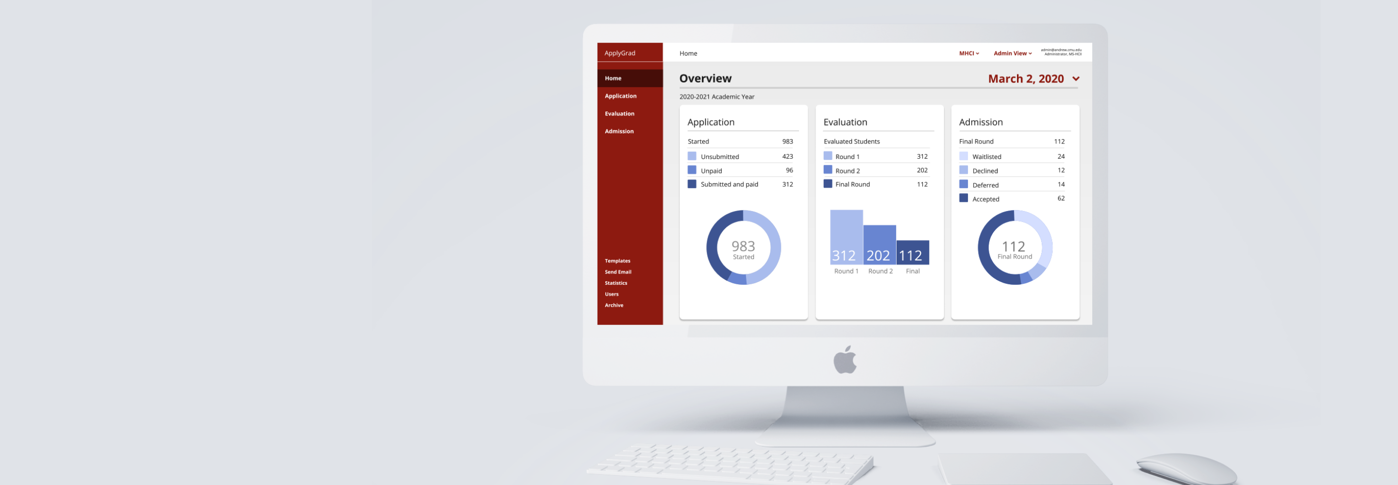
A redesign of the system's interface, a new navigation system and improved information architecture to improve the match to the user's mental models. We were then able to provide the high-fidelity prototype and design specification to the developer for implementation.
IMPACT
Imroving administrator's efficiency and providing the foundation for CMU to select the best applicants worldwide.

1. Directly Supports a sequential workflow

2. Increases productivity and efficiency

3. Create a system users want to use.
GOAL
How might we redesign the system to support graduate administrator workflows during the application process?
RESEARCH
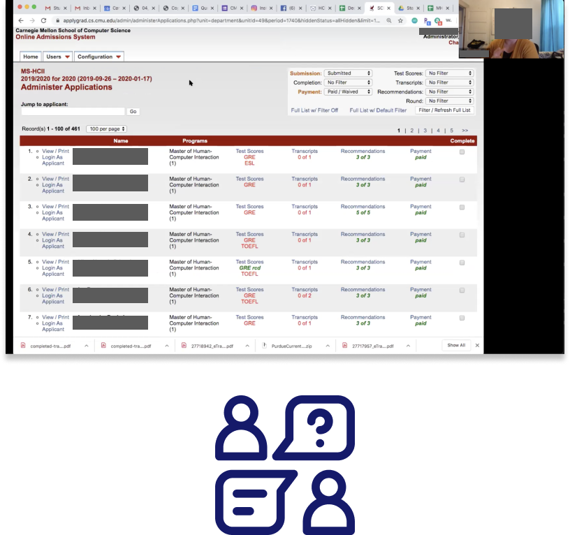
A contextual inquiry helped us understand the work flow of administrators, who use the system for 9 months every year
We conducted a remote contextual inquiry with our program administrator to understand how she uses the system. We watched her go through the application process, evaluate a potential applicant and assign them a decision. We were able to take detailed notes and learn the workflow of how one would use the system.
We understood that there were three key sections and time periods: Application, Evaluation & Admission. We also learned what tasks needed to be done in each section, how a user would approach these tasks and some of the frustrations the user felt in certain areas.
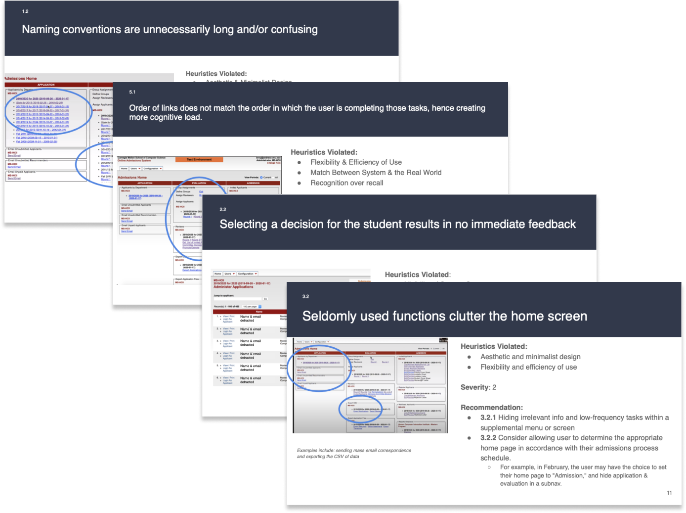
We conducted a Heuristic Evaluation of the system to comb for usability issues
As a team of five, we each conducted a heuristic evaluation of the system and recorded all our findings in a spreadsheet. We combed through all our findings, grouped together all the overlapped findings to create a summary and then was able to assign severity ratings to the violated heuristics in the system.
Key Findings From our combined Heuristic Evaluation
- Inconsistent visual styles, naming conventions, and hierarchies
- Home screen is unwieldy and inhibits efficiency
- Multiple roles forces users to switch to accomplish different tasks
- Progress tracking is not supported by the interface
- System requires admin user to perform singular actions manually
- Organization of lists is not intuitive
- Lack of feedback from user actions requires manually confirmations
- Current workflow doesn’t match user’s mental model
Thus: “The system that was meant to support users actually created more work”
A Impact-Effort matrix helped prioritize our focus in collaboration with the developers
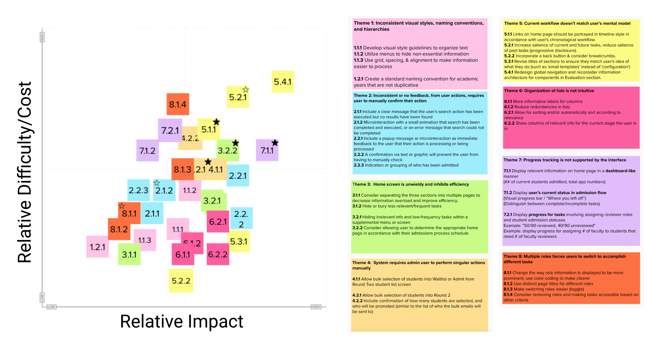
Here we were able to accordingly place all our findings and decide our focus in order to have the highest impact with the lowest cost of implementation. We all agreed that creating a new home and dashboard would be the most important for users to be able to readily be able to know the current state of the admission process as well as key metrics to easily report to their department.
The matrix was also shown and discussed with the developers of the platform, in order to fully gage what would require a highest effort from their end.
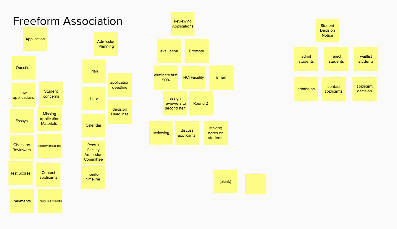
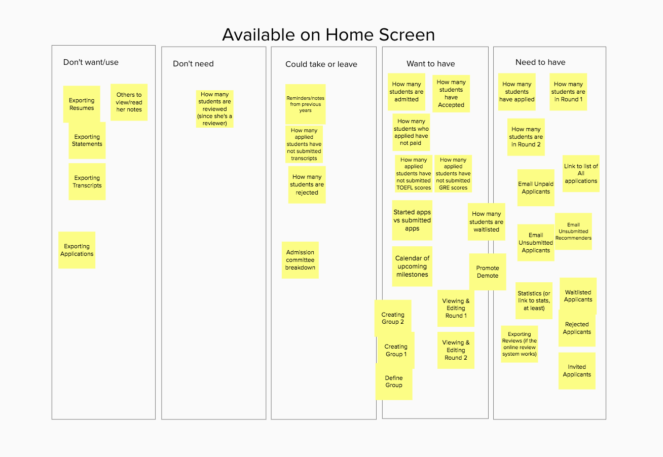
A card sorting activity was conducted to understand the mental model of a super user
We conducted a card sorting activity with a super-user who has used the system for fifteen years, in order to understand their mental model of the entire system. There were two parts, the first a free form exercise to see how they group actions, and the second where we had five categories for the user to move cards into.
The entire card sorting activity was done remotely using Zoom and Mural.
DESIGN
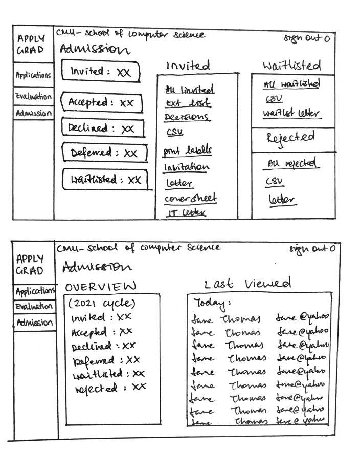
Could re-grouping the data make the content more manageable?
We created low-fidelity sketches to test reformatting the data. The current interface did not offer meaningful organization.
There was also a focus on providing data summary on the top of each section.
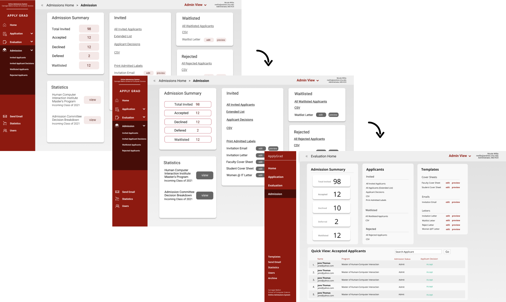
We divided the screens to be prototyped and I was responsible of the Admission section.
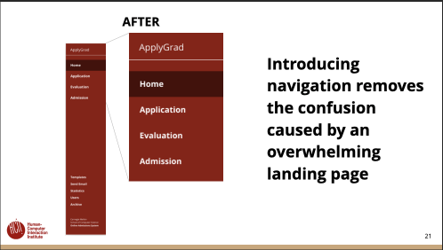
As a team we decided it would be best to separate the overall system into three sections as shown in the left navigation bar, as a user would be in a different stage of the process at a different time. They would move through each of the stages during the admission cycle. Thus, breaking up the sections can help reduce the cognitive load of having all links and information on only one section.
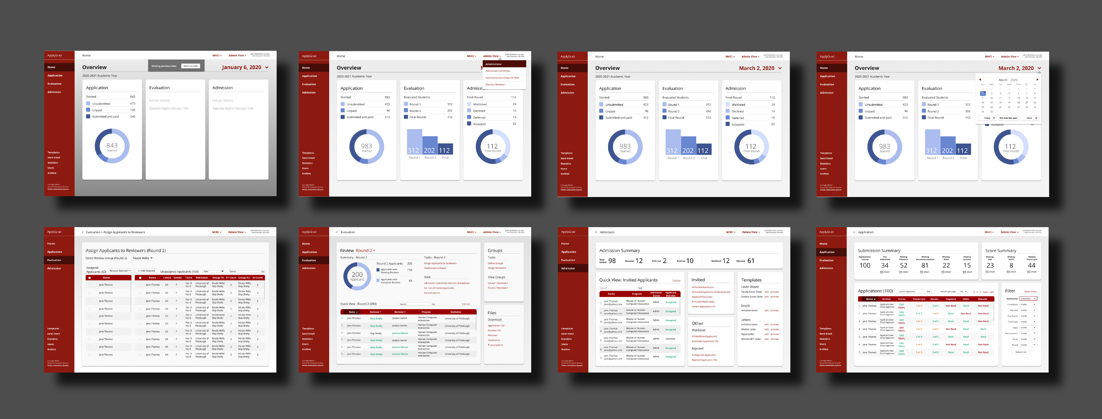
From looking at our card sorting activity it seemed clear that a new home page would be needed to give the user an overview of the entire section. We also wanted to help the user be able to pull quick information at a glance, if it needed to be shared to faculty or heads in their department.
The Design Opportunity:
- Create a new landing home page to give the user a quick view on the current status
- Integrate a calendar component to allow a user to view milestones and important dates
- Allow the user to access important data from each section quickly
We conducted A/B testing with Mid-Fi prototypes to test usability of a new interface that supported progress tracking
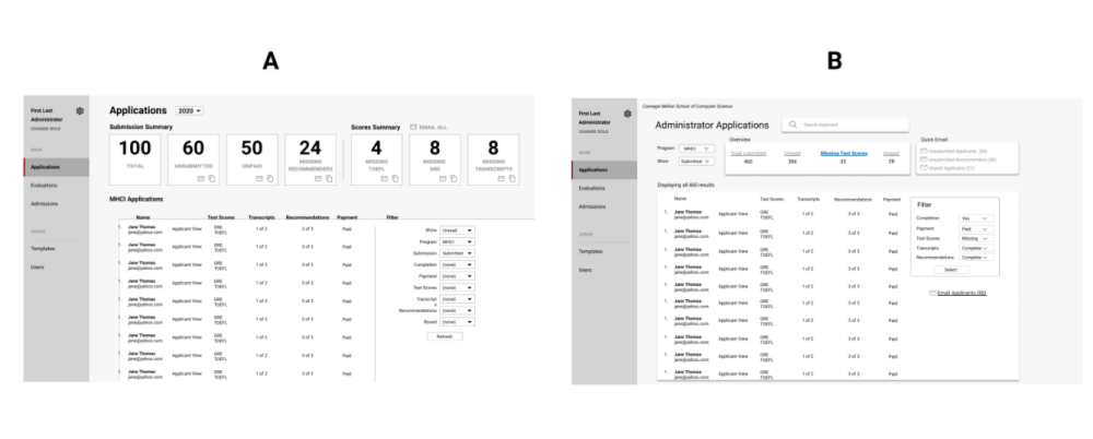
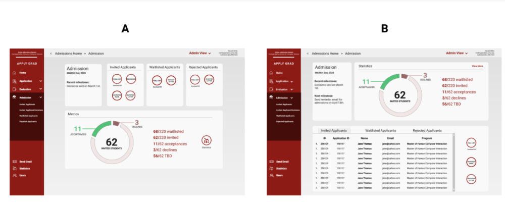
Although a calendar function seemed crucial from research, I was suprised by the negative feedback during user testing
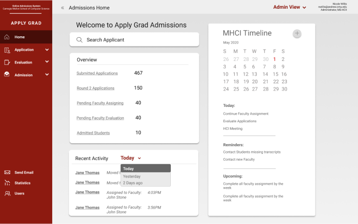
Key Three Validated Needs


Data Summary
Home page summary & quick summary of key numbers in each section
“If the Dean is asking, then I need to pull up the stats to compare this year to a previous years”


Progress Tracking
The new home landing page offered users to be able to easily view and track their progress across each of the different stages. Different users would also be able to see the progress for an entire program.


Task
Reorganization
“Makes sense that it is grouped by tasks and then things that you can view”
Key Three Unvalidated Needs


Personal Calender & Reminder
Although our card sorting activity had strongly indicated a need for a calendar and planning function, users did not feel drawn to use it and have to manually enter their information from their own calendar.
“Would still probably use Outlook”
“Might be helpful if it kept deadlines from last year”


Recent Activity Log
Users seemed intrigued by the idea, but once we looked back at our understanding of the work flow, it did not seem to add enough value for users when actually using the system.
“There are many actions happening at the same time for many people so not sure how this would show up?”
“Wouldn’t hurt, but doesn’t seem necessary”


Favorites in Evaluation
Although users were not strongly against this feature, during testing they did not feel drawn to use this in order to simplify their work flow.
“Confused between it being my most recent or ones I can set myself”
“I don’t feel enough of a need for the favorites, maybe if they were global instead?”
We created our style guide for us to all follow for our final screen design
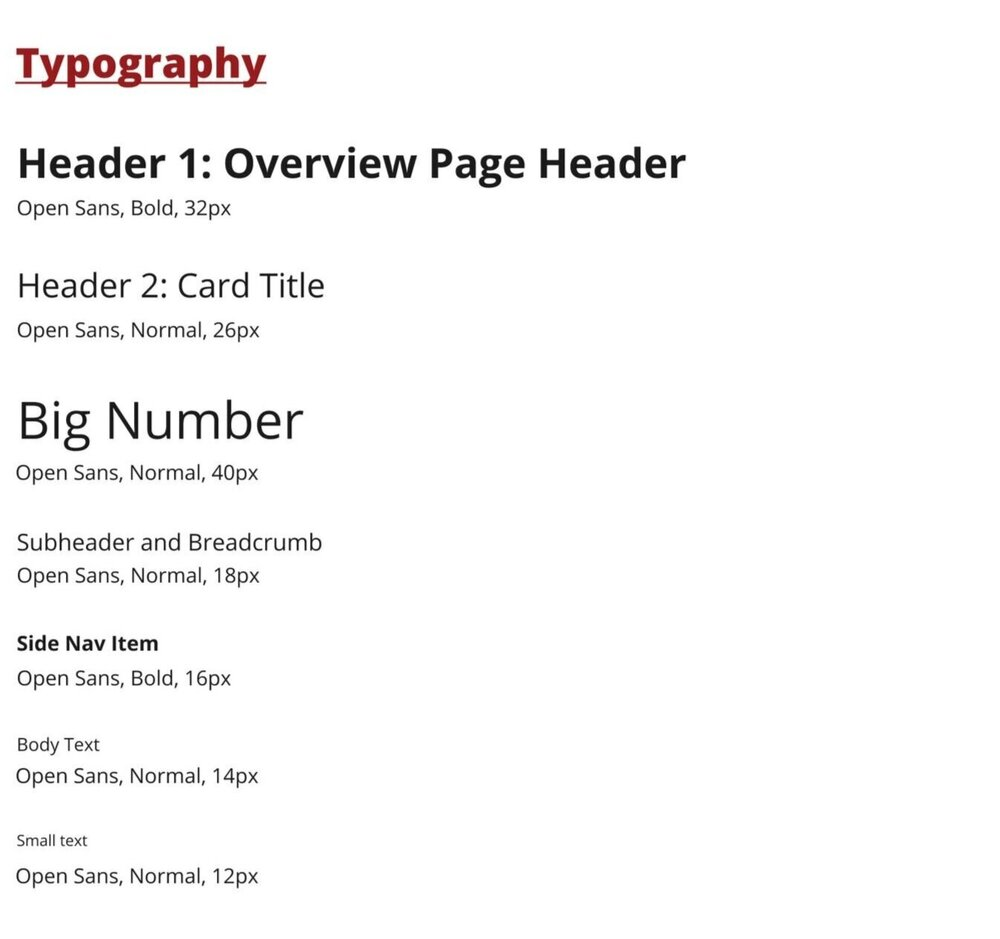
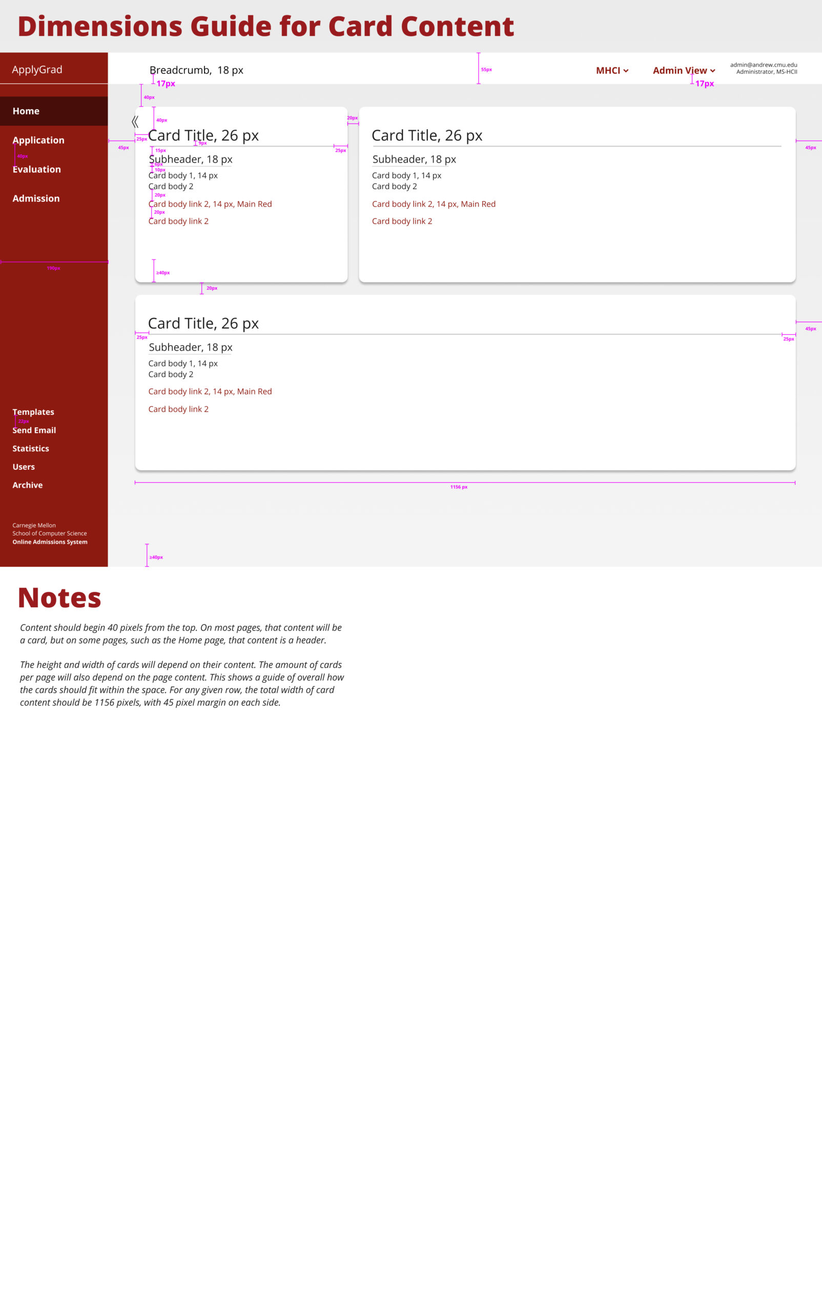
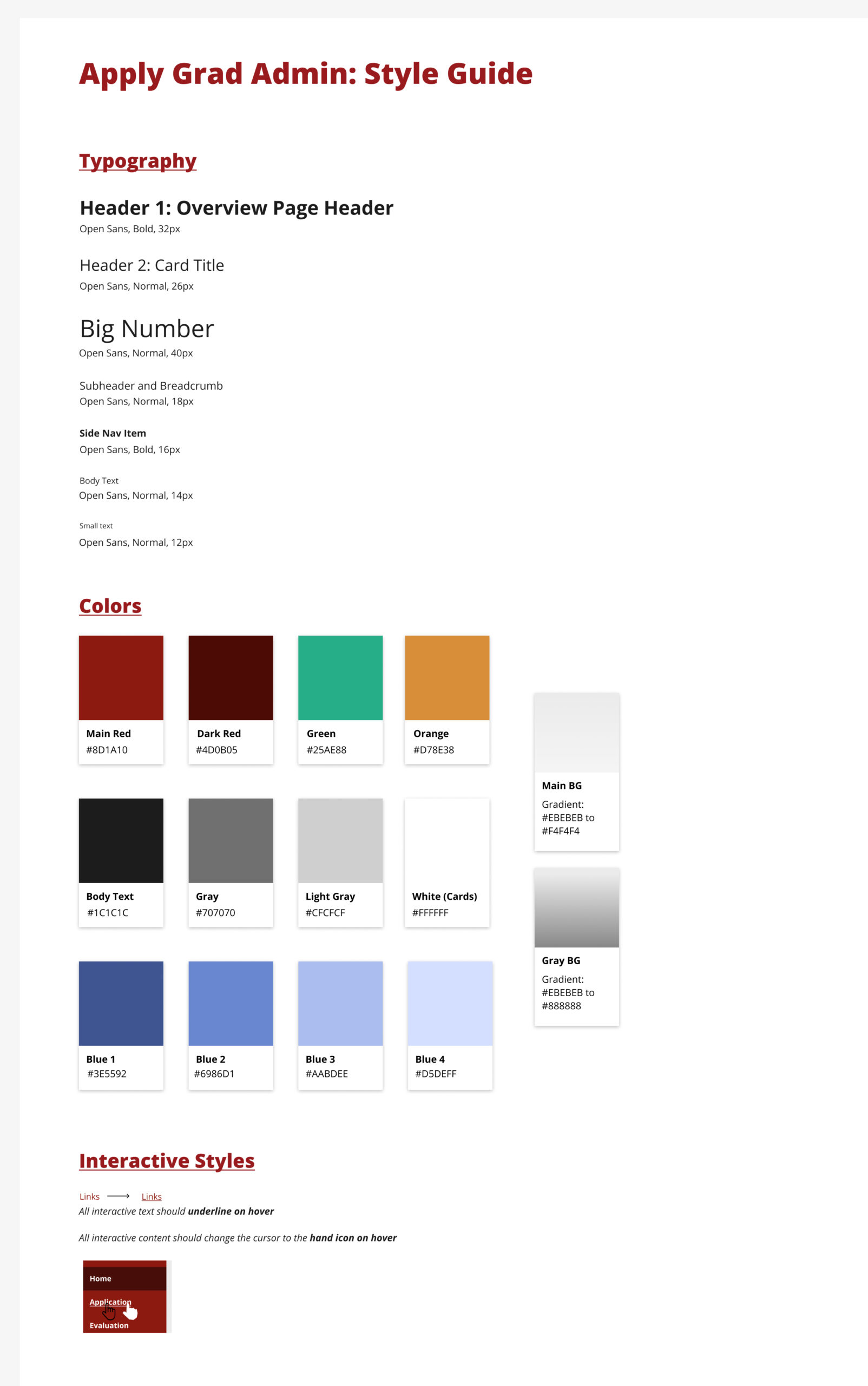
Final iteration on the Admission section based user testing & team's design critique
High-Fidelity Interactive Prototype
My Final Admission Screen Design
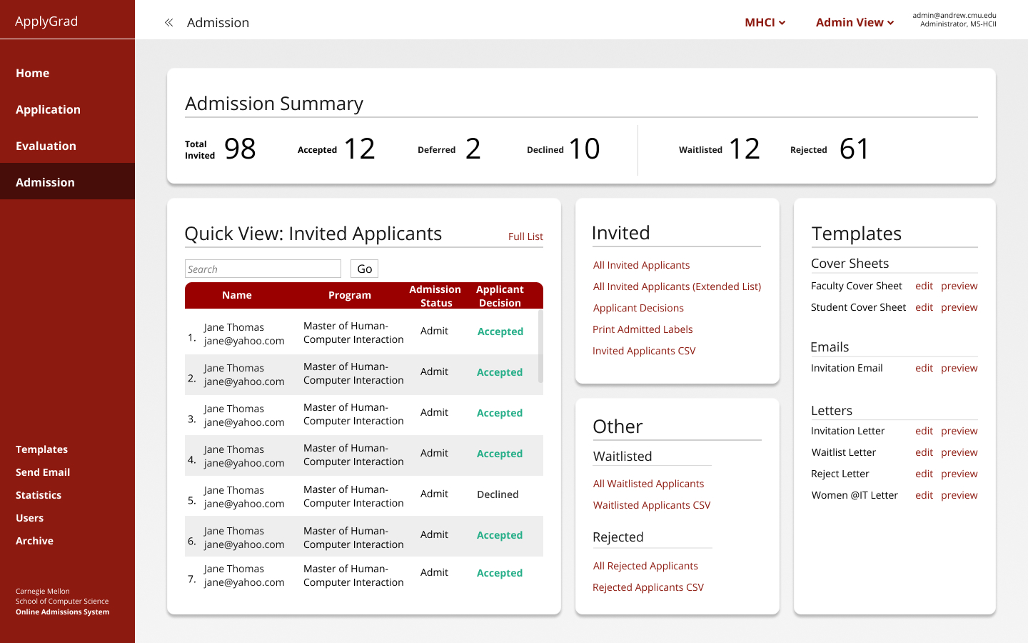
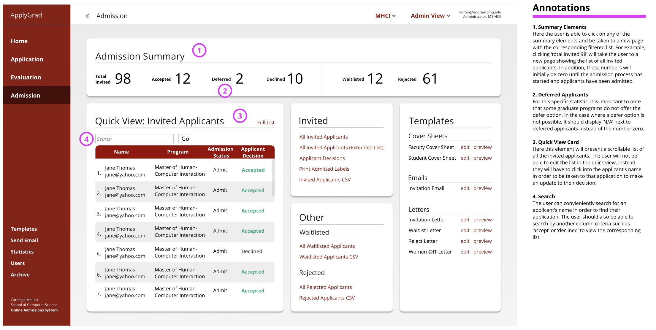
Grouped into five cards: The admissions summary, the quick view, invited, waitlisted & rejected and the templates. The cards have also been organized to match the different tasks the user will want to conduct during the admission process.
Admission Summary:
Allows for a quick glance at data to easily pull and report at department meetings
Previously participants were keep tracking of these numbers in their own external spreadsheets
When a user first comes to the page, they are immediately able to at a quick glance view the first card which is the admission summary.
Overall, the new design makes the content easier to digest, locate, and better match the user’s work flow.
We created and submitted a full design rationale write-up for the development team to move to implementation
Refelection
It was an enlightening experience being able to empathize with administrators who manage applications and work dedicatedly to ensure an adequate class of incoming class graduate students. It was fulfilling creating a meaningful design that would increase the efficiency of the administrators using the system. It was also a memorable challenge having to complete the entire project remotely due to COVID-19, but still being able to work with my peers, the developer and administrators each week.
We were able to pitch our final redesign to the budgeting team at Carnegie Mellon University, in order to help gain funding for the development and implementation.
With more time and to take the design further, we could research into incorporating new features such as forecasting and predictions to help administrators make decisions and be able to better manage the waitlist, especially during unpredictable times.
Selected Works
