Monitair
Real-Time IAQ Monitoring
for Buildings
[UI & UX Design]
TEAM
Amrita Sakhrani & Shira Miasnik
TIMELINE
6 months
ROLE
UI Design Lead & UX Designer (Branding, Interactive high-fidelity prototype, and the UI components for both iOS & Android).
CHALLENGE
Businesses fear about the health and safety of their occupants in buildings given the heightened fear of enclosed spaces since the beginning of the pandemic. As a leader in the IAQ field, we wanted to help provide the means to allow buildings to track the health of their indoor air.
SOLUTION
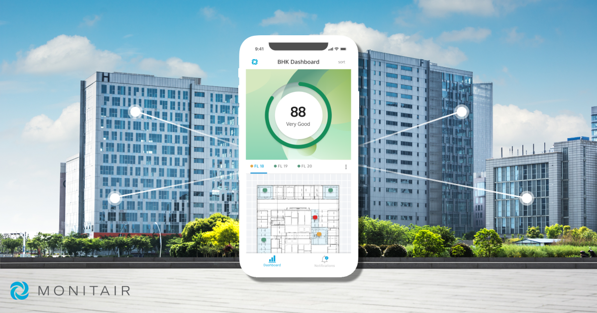
A B2B enterprise mobile application allowing commercial buildings in Hong Kong real-time insight into their facility.
IMPACT
Increased traction from educational institutions in Hong Kong and investor funding.
GOAL
How might we support businesses in maintaining a safe indoor environment for employees?
RESEARCH
Domain research to understand the field of IAQ (Indoor Air Quality)
Sources of indoor air pollutants: Oil, gas, coal, wood, tobacco products, products for cleaning & maintainenance, central heating and cooling systems, humidification devices, outdoor sources radon, pesticides, outdoor pollution.
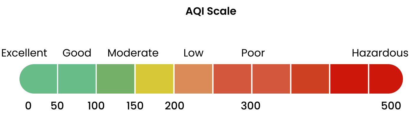
Understanding AQI: Yardstick that runs from 0 to 500. The higher the value the greater the air pollution and greater the health concern. EPA establishes 5 major pollutants.
Highlight: Managers keep a close eye on reports to see a building’s performance against sustainability targets.
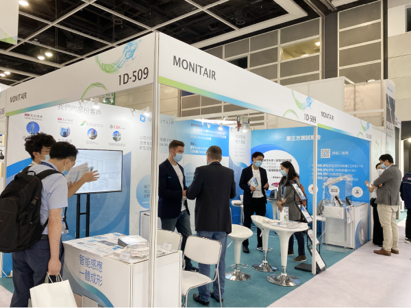
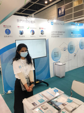
Conducting Guerrilla Research to understand user pain points
We had a booth at the Build For Asia Expo, 2020. I was able to visit other booths and have casual conversations with the public to understand their take on monitoring IAQ.
Attendees: Property Managers, Engineers, Engineering Consultants, Building Management
Creating Archetypes to empathise with our target customers

Property Executive
"I just want to know we are meeting the required standards"
- Off-site
- Managing Multiple Properties

On-Site Manager
"I want to know if occupants are safe in my facility"
- On-site
- Handling day to day tasks for a single property
Review Mining of Competitor's Apps to look for common themes for improvement in the marketplace
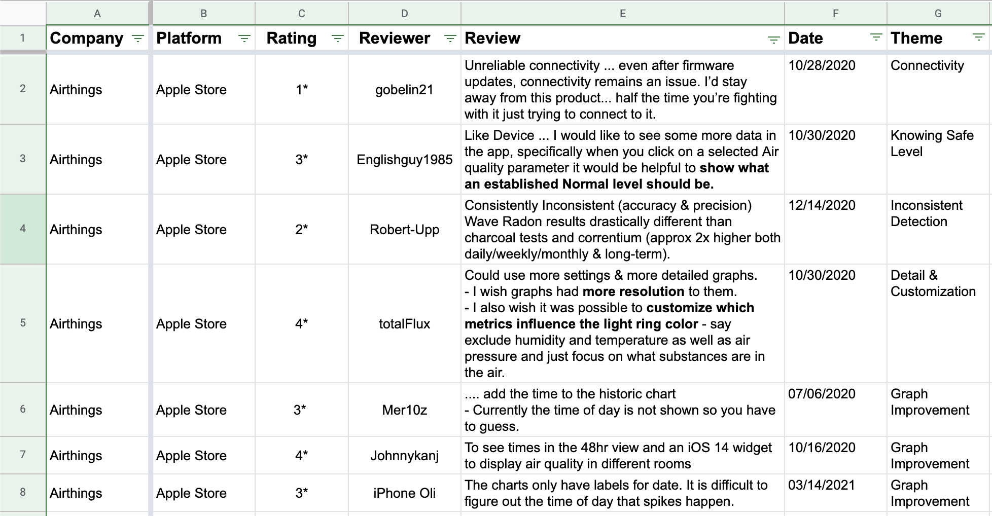
General Findings
- Poor connectivity / Connection Inconsistency
- Lag time due to bluetooth
- Wifi enabled would be faster
- Graphs are not useful > No time on charts
- feature needs improvement, not easily able to scroll back in time
- No landscape option for tablet
Ideas for Improvement
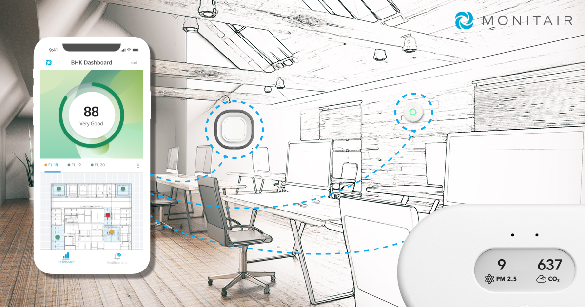
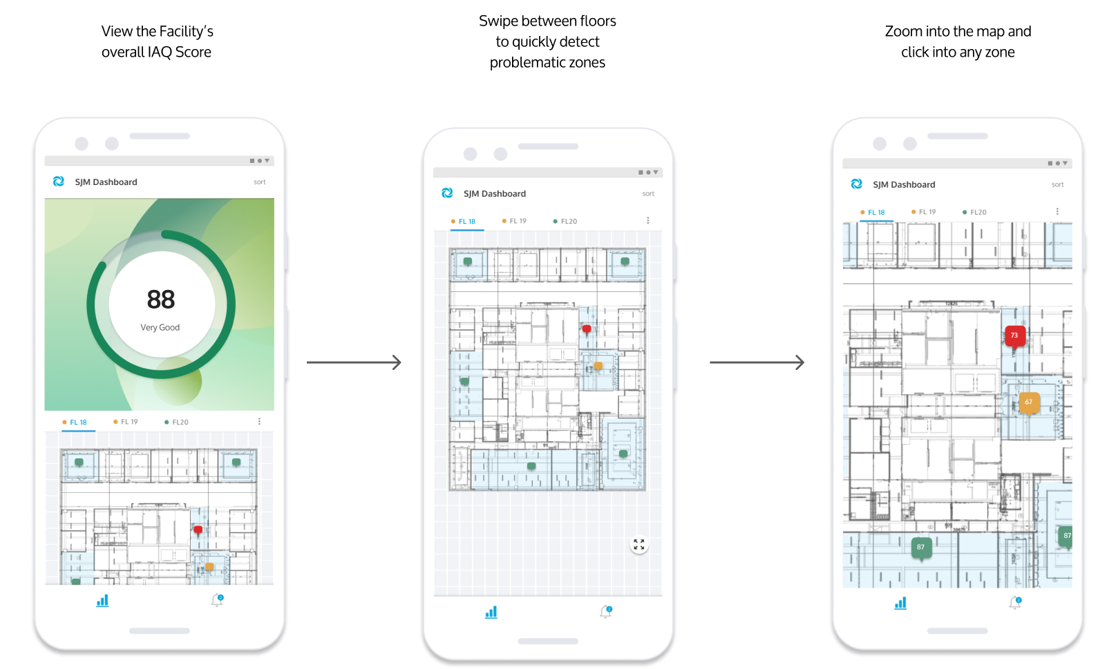
- Introducing a map/floorplan feature for facilities
Seeing how the score is affected when un-checking certain paramters
- Ios 14 widget showing score across rooms (e.g. like weather widget)
- Highlighting spikes on charts > making it easier to detect
- Easier way to compare numbers back in time? (But would the average user do this? Seems they just want to know current stats)
DESIGN
Creating a Moodboard for the visual design and branding of the product
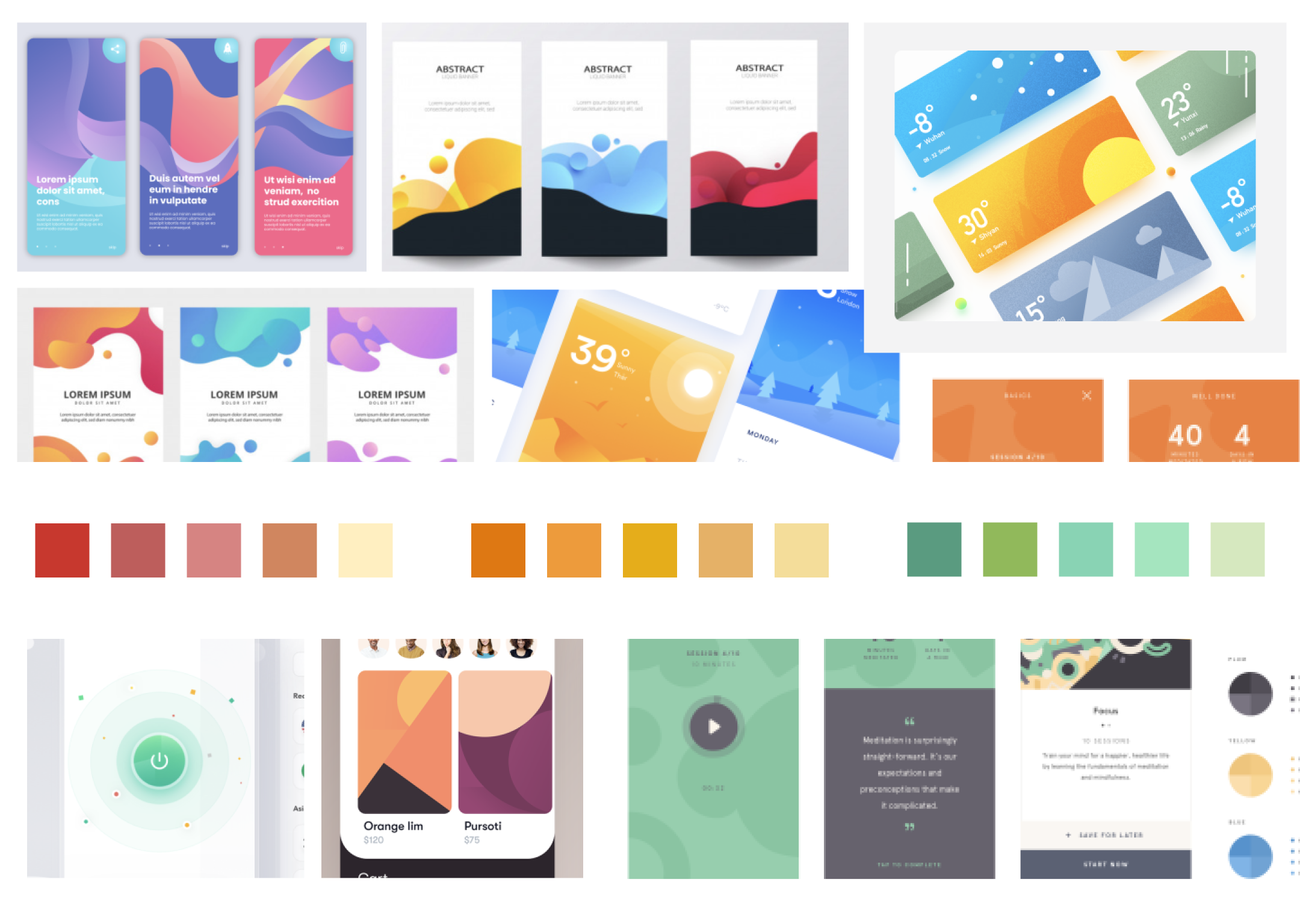
How could we create a visual aesthetic to ensure technical data was amiable?
Finding the sweet spot between scientific and delightful.
As a part of the UX and Branding we were searching for a factor of delight and pleasure when using an otherwise technical application. We did a brainstorm and mood board sessions together to try and gather inspiration for how to create this throughout the app’s interface. Some of the inspiration came from the delight experienced in Headspace through the soft gradients and illustrations.
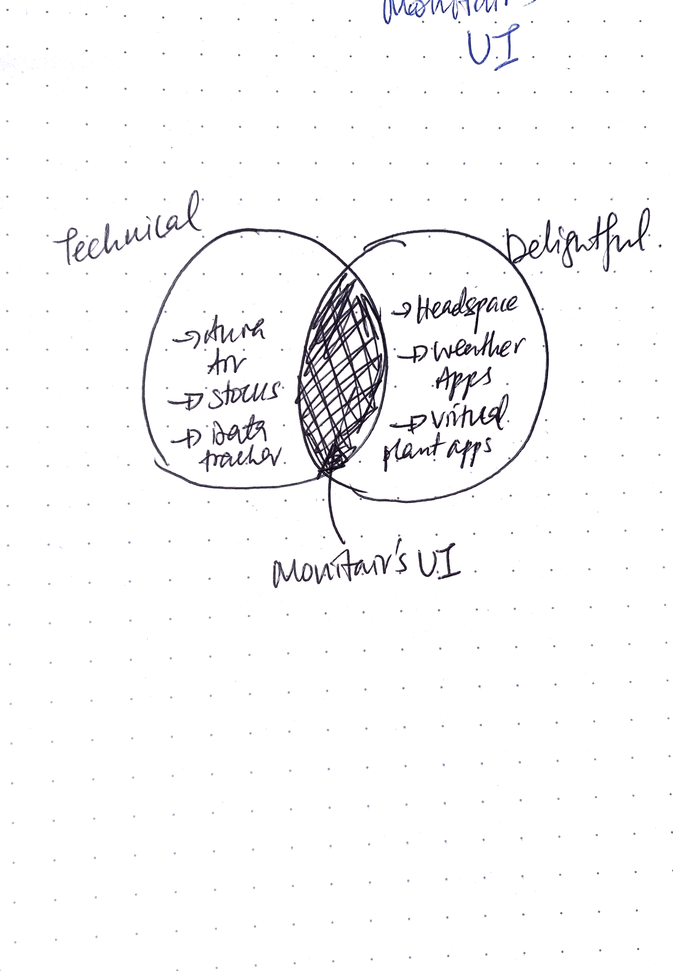
Exploratoration to find the visual design to depict IAQ
With IAQ being an upcoming industry, I struggled to find an appropriate yet fresh way to represent the current state of a facility’s indoor air quality. The current branding of our hero image on the website was based on vibrant green plants inside a modern office, to convey the emotion of fresh clean air indoors.
Thus, I began with the motif of the green plant and leaf.
With a confirmed what, it was time to completely exhaust a wide variety of UI design directions for the application. The design phrase “quantity leads to quality” is what I used to guide me through the process of all the different ideations.
I ran through over 30 different design ideations to find the correct representation for our brand and indoor air quality.
The short listed design directions included:
- Animated Plant changing depending on the IAQ
- Air Molecules changing density depending on the IAQ
- A productive individual with good IAQ
- A working fan
- Abstracted circles
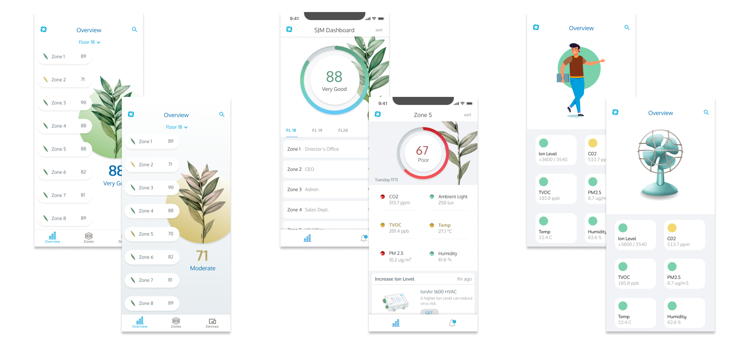
Rapid User Testing with 3 different design metaphors to select a final design
Tested on team members, friends and people in the co-working space.
Most appeal for an abstract design background that is gentle and subtly indicating the indoor air quality.
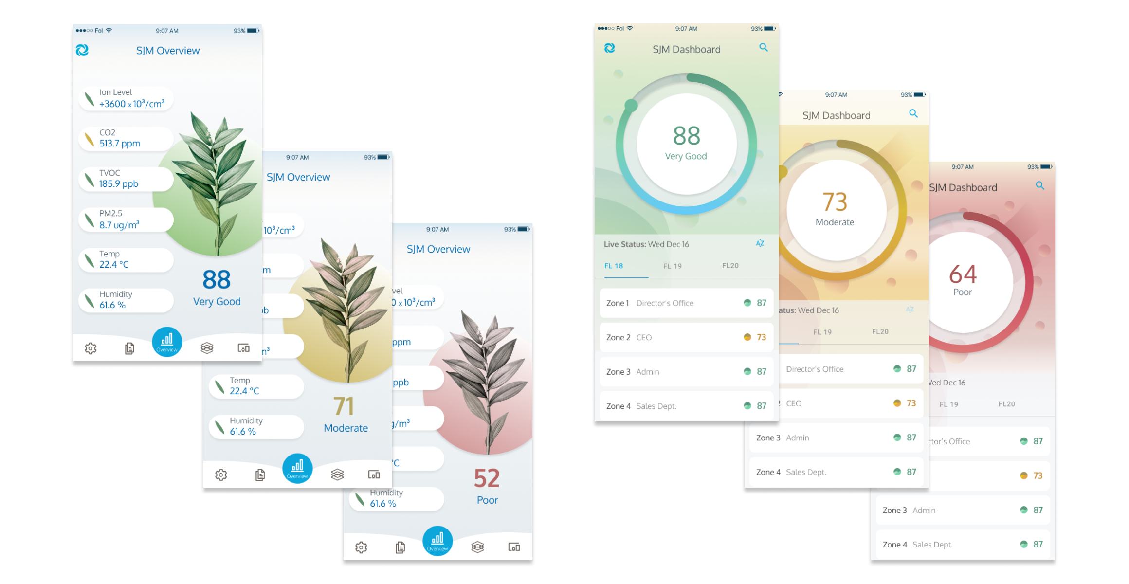
Testing the efficacy of icons for technical IAQ metrics
Based on the moodboards and inspiration I took from other apps, I felt strongly towards using icons to represent the different metrics. However, after discussion within the product team, we acknowledged that icons are typically used to communicate a concept faster than the text - but in this case of a technical parameter such as TVOC or PM2.5, an icon would not necessarily do this and text was necessary. In addition, people are already familiar with the icons for temp and humidity, which drew more attention to these metrics and away from the other metrics that were providing more serious information.
For right now, it was a compromise to avoid the temptation of icons and just proceed with the names of the metrics.
If not icons, then what was the next alternative?
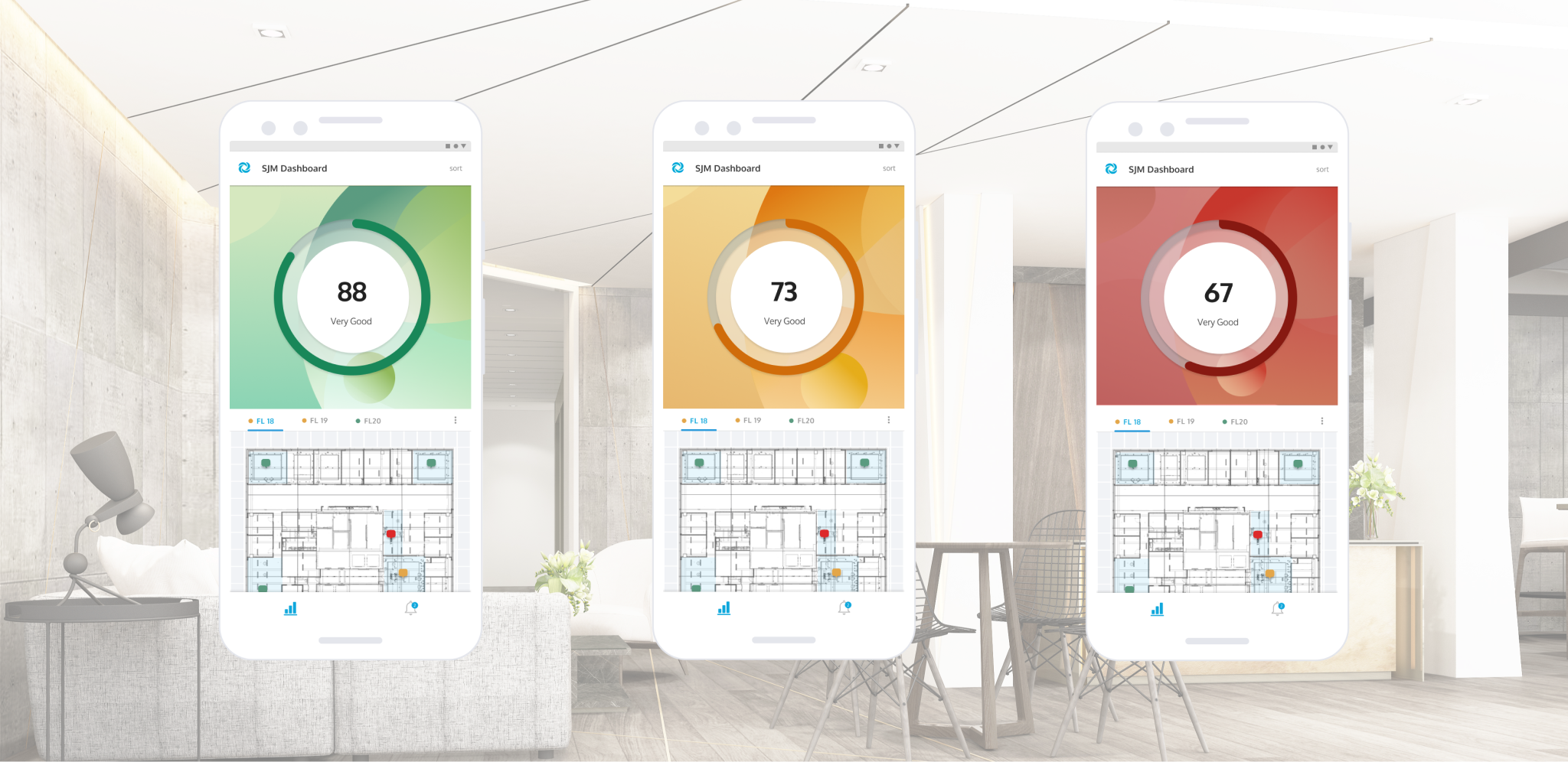
We decided to continue to build upon the abstracted round design and I created a set of three indicators for a zone. I was challenged with elevating the coloured dots for a quick understanding of the score.
Creating mid-fi wireframes with our user's needs in mind
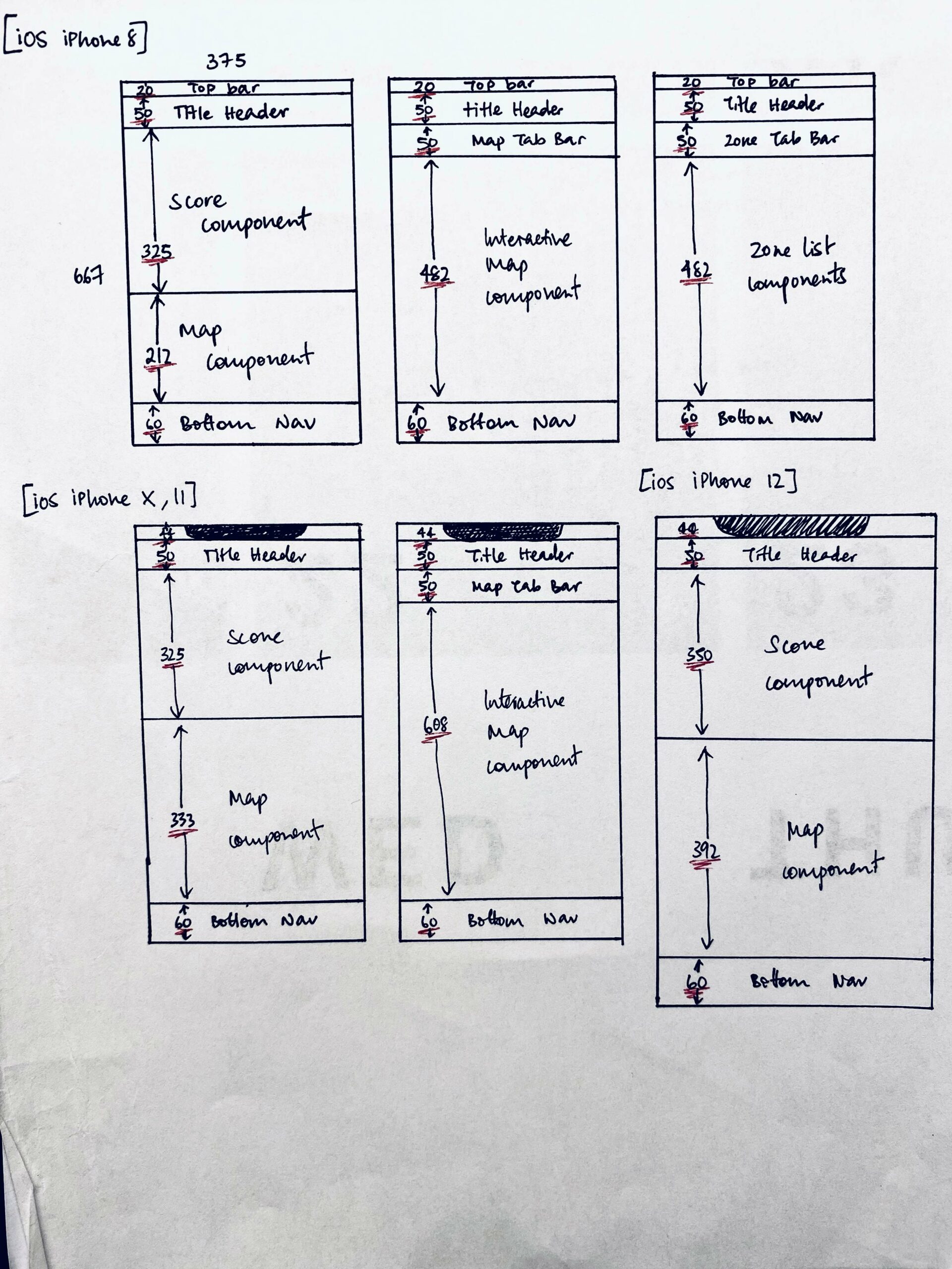
We began with the smallest iOS screen ratio for iPhone 8 to work through designing the key components to include and create an effective user flow.
Creating the High-fidelity Interactive Prototype for efficient development under a time crunch
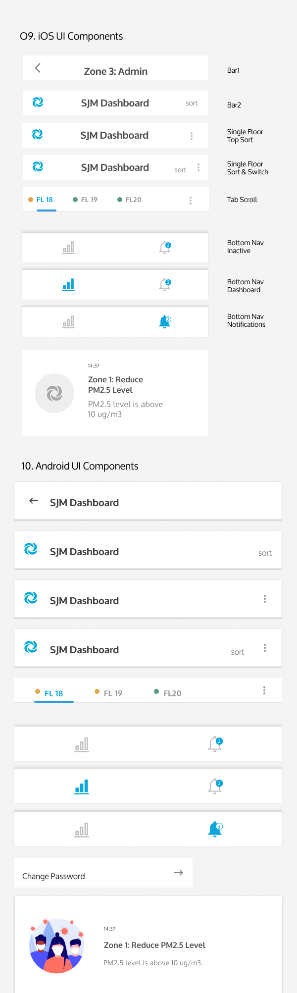
When creating the interactive prototype, I knew the developers were using React and thus chose components from React compatible libraries - primarily Material Design. We had the aim for building V1 of our app as soon as possible and thus it was important to select the most efficient components to reduce the time spent on customisation.
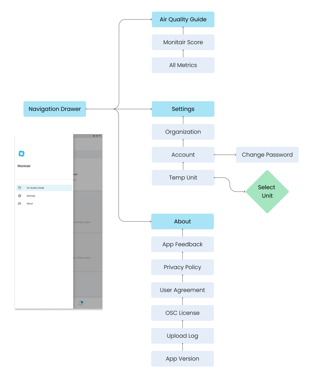
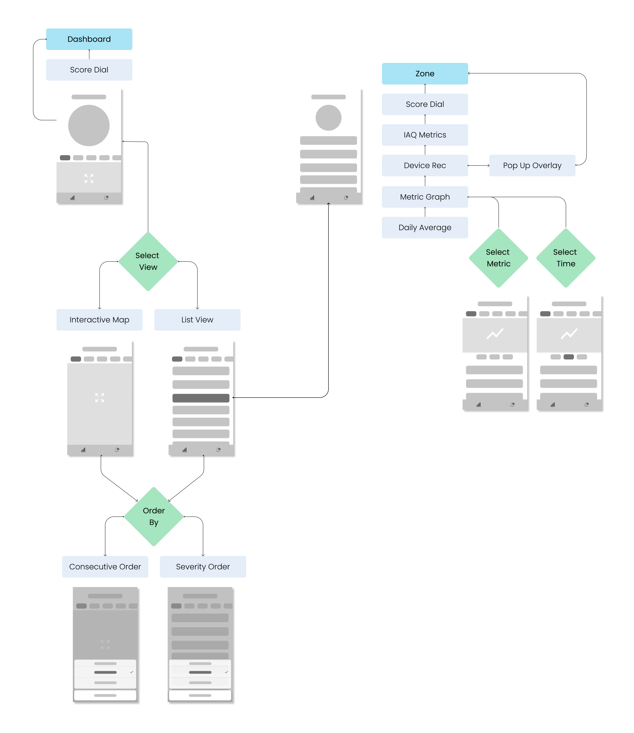
Outlining the information architecture for all the screens to be prototyped
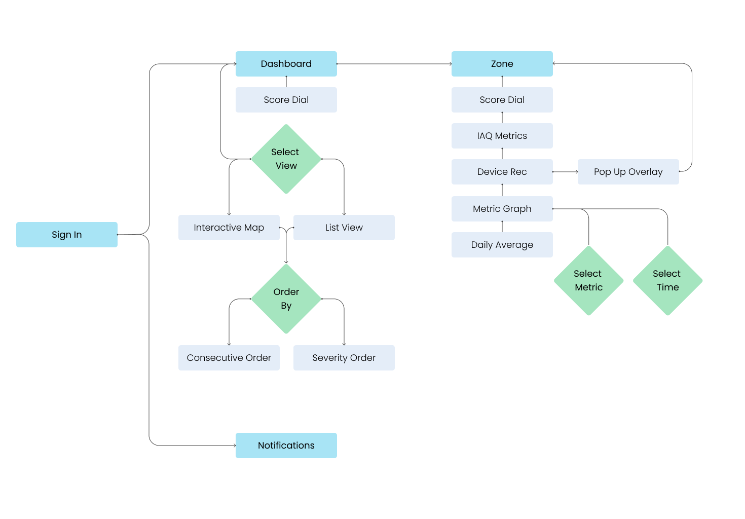
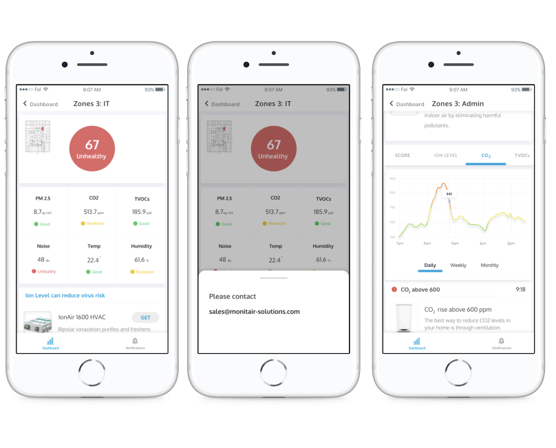
Working through the interactions, from the home dashboard
Planning & Testing component responsiveness and measuremnts for different devices
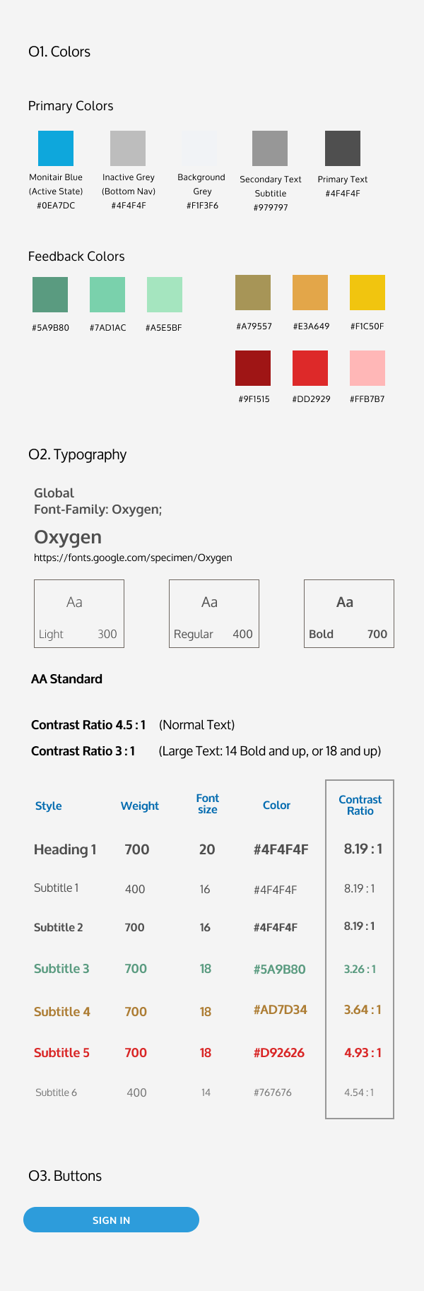
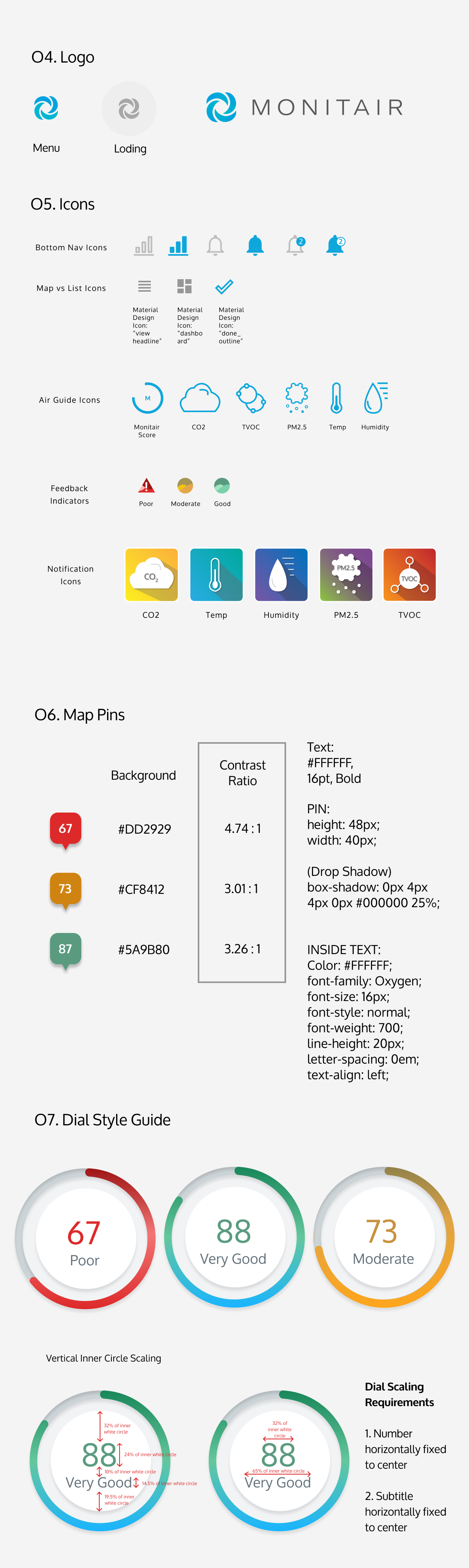
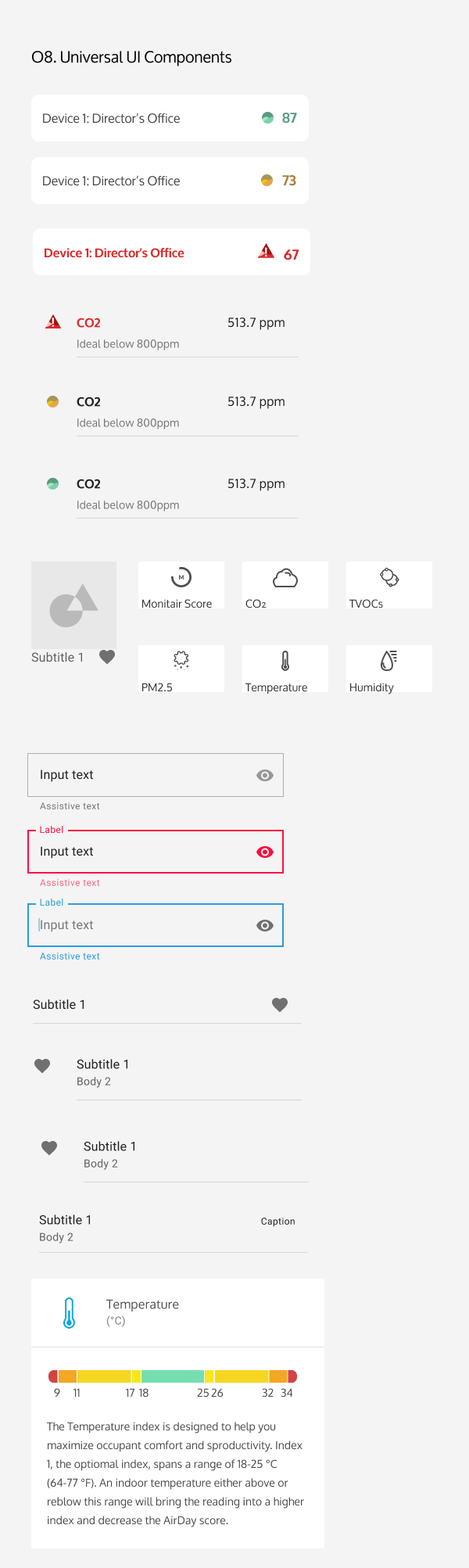
Design System & Style Guide created to meet WCGA AA Compliance
High-Fidelity Interactive Prototype
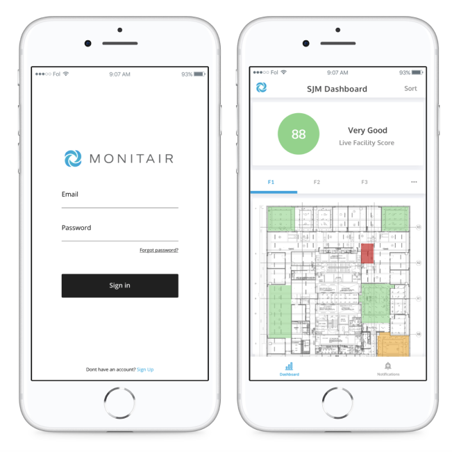
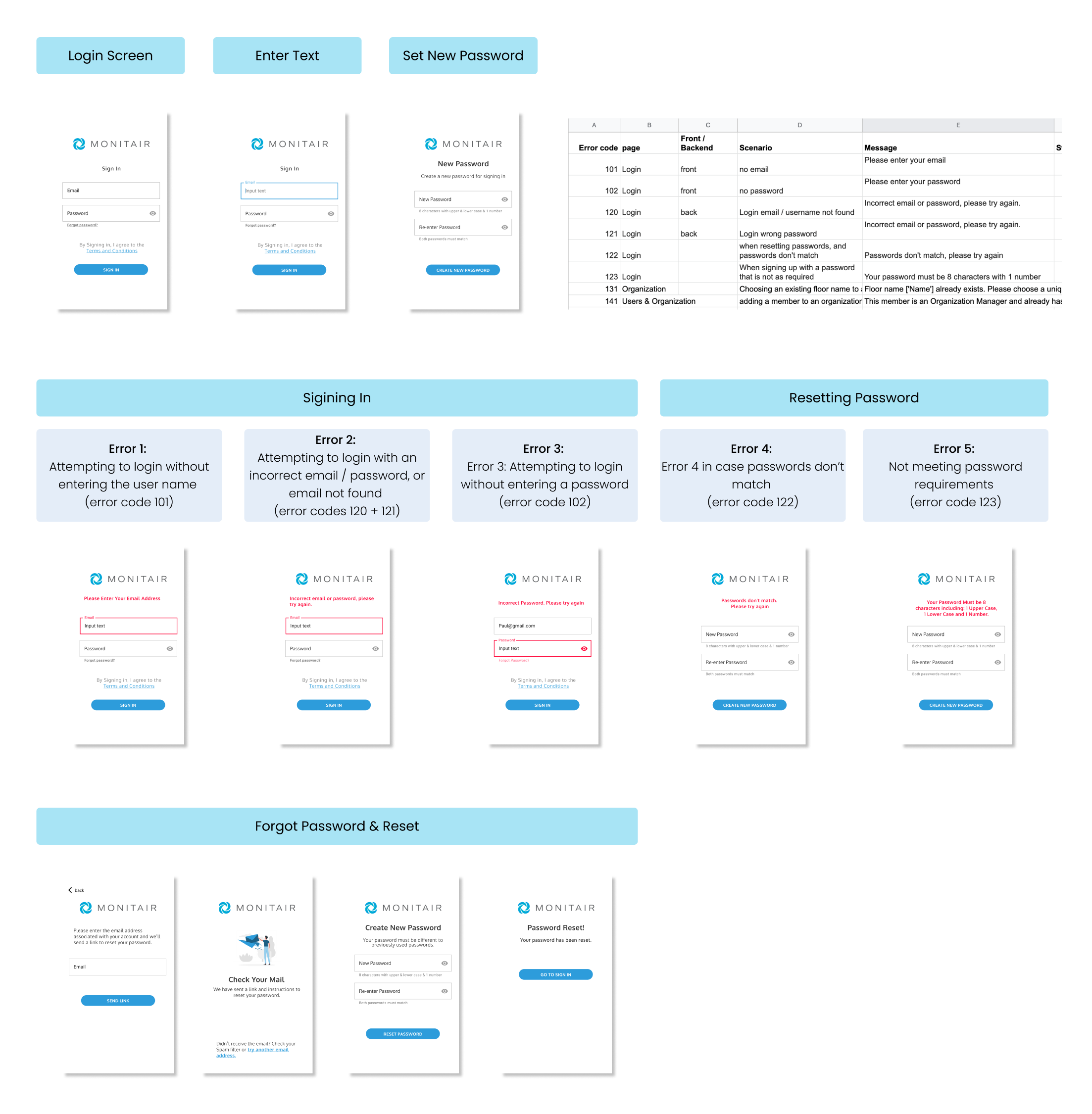
Creating, documenting & testing the full login flow with errors and guidance
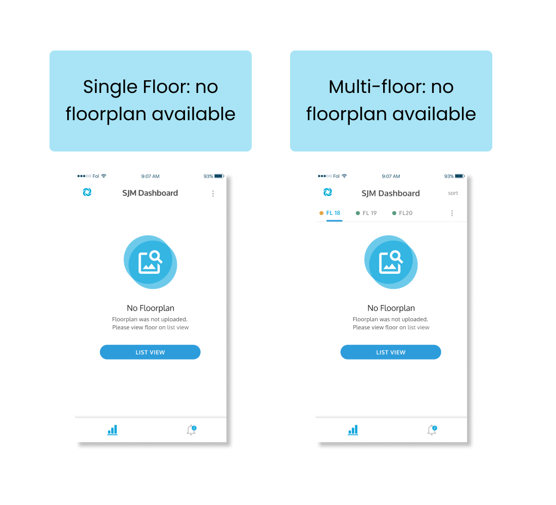
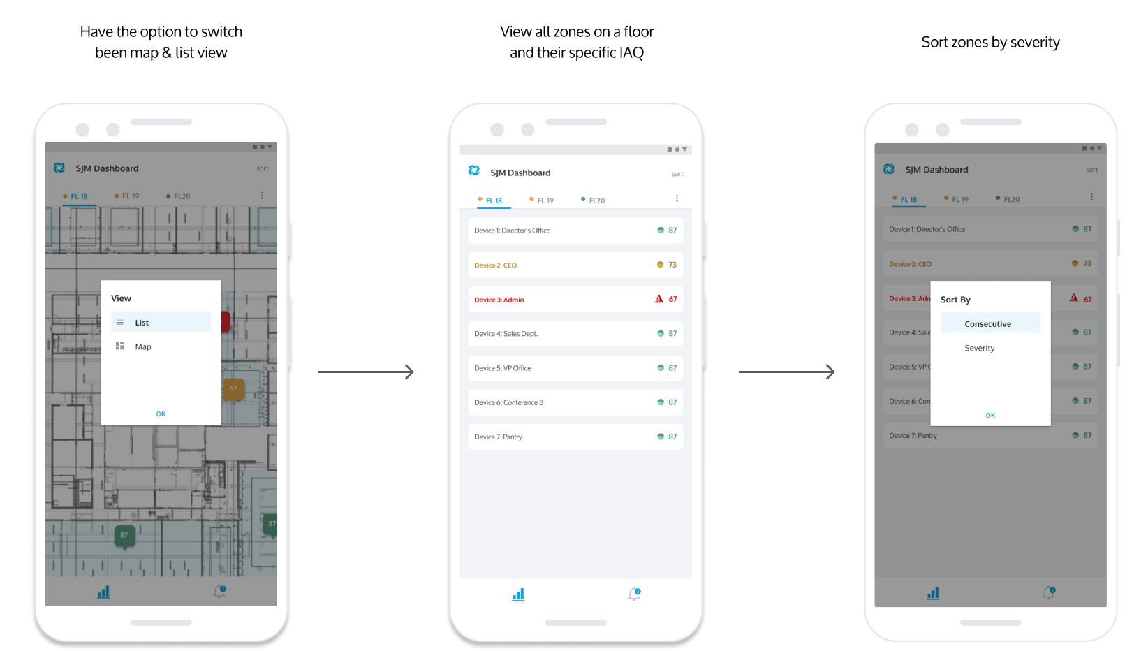
After user testing, we realized we needed to include a no floorplan view
Included a more helpful screen, with icon & button for users to quickly jump to list view
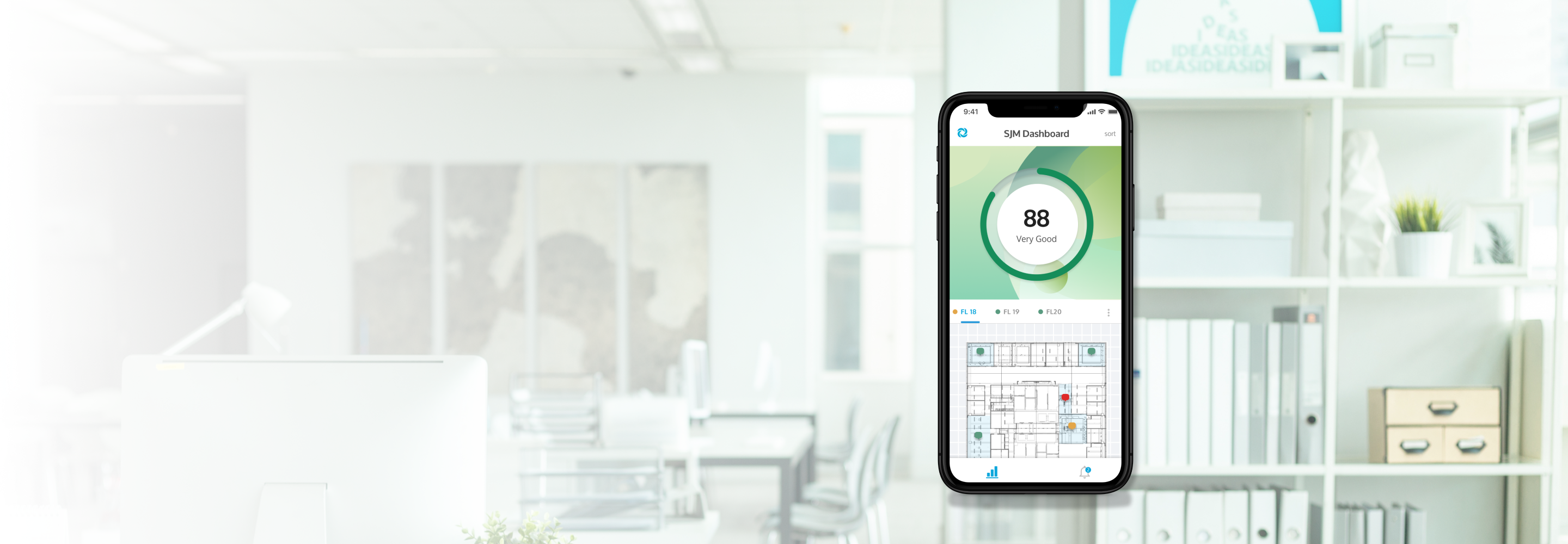
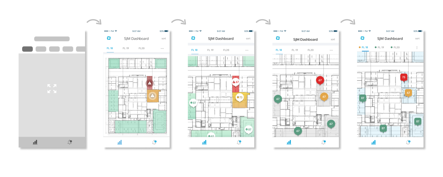
Design Iteration of the map component to allow quick detection
We decided to include map pins, with colors to allow users to quickly click into a red or amber zone and view the IAQ metrics of that particular zone.
The colored green zone showed more over-powering leaving us to a blue highlight across & colored pins for status communication.
Refelection
It has been a great learning experience being the lead UI and working through selecting and creating all components for the design system. I've learned to think about:
- Scalabilility as more metrics become available by sensors
- UX writing when creating filters and sort options for better clarity
- Utilizing components from design libararies for lower cost development and pre-existing scalability
- Thinking about design options and modals for iOS vs Android
- The impact of color in feedback design
Selected Works